Overview of Text Editor Toolbar (Ultra)
What is the Text Editor Toolbar?
The text editor toolbar is available on a range of tools within Ultra courses that utilise a what you see is what you get (WYSIWYG) text editor.
Why would I use the Text Editor Toolbar?
The text editor toolbar enables you to insert content as well as providing the user with options to provide a range of formating on the text.
List of functions
The following table provides a list of the functions that each button and drop down list provides
| Tool | Purpose |
|---|---|
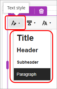 | Text style button drop down list options for the selected text.:
Tip: To improve the accessibility of your text ensure that you use the the text style options in order from top to bottom. |
 | Font button drop down list options for the selected text:
|
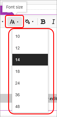 | Font size drop down list options for the selected text:
|
 | Colour picker drop down list options for the selected text:
Note: Colour options are limited in Ultra courses for improved accessibility. |
 | In order, from left to right:
|
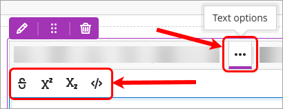 | Text Options, from left to right:
|
 | Create or edit a table plus size selector |
 | Table options from left to right:
|
| Tip: A Header row and if applicable a Header column should be used on all tables. Accessible tables need HTML markup for header cells and data cells, as well as for defining their relationship. Assistive technologies use this information to provide context for users. | |
 | Alignmnet options drop down list options for the selected text:
Note: Alignment options do not apply to Images inserted into the textbox. |
 | Lists, from left to right:
|
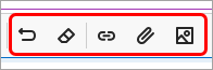 | In order, from left to right:
|
 | Insert content drop down list options:
|