Course Insights - Engagement section (Ultra)
Overview
The Engagement section aims to provide you with information extracted from the learning management system with which students engage as part of their course learning activities.
Note: The information provided should only be used as an indicator and not as a measure of academic success. Although student engagement with teaching and learning systems has been proven to correlate to better academic performance, a student may still perform well without active use of these systems.
Insights to Investigate
- Have all students accessed your course materials?
- Do you have a large number of students who have not engaged with content?
- Do you have students who have not completed formative assessment tasks?
- Which videos (based on video pauses) were the most challenging/confusing for the students?
How is engagement calculated?
Student engagement is measured by the average activity pattern per student, which is based on the student being active in Blackboard or edX Edge (i.e. clicking or watching a video).
Tip: Click on the Definitions in the Engagement section to find out more.
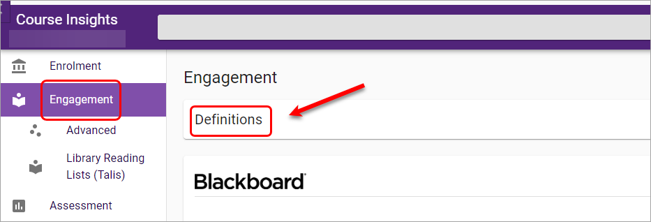
The definitions of engagement will be displayed.
Using Filter to identify groups of students
The Filter in Course Insights can help identify student or groups of students who have relatively higher or lower engagement , so that staff can have some early interventions or nudges to support students' success in their learning.
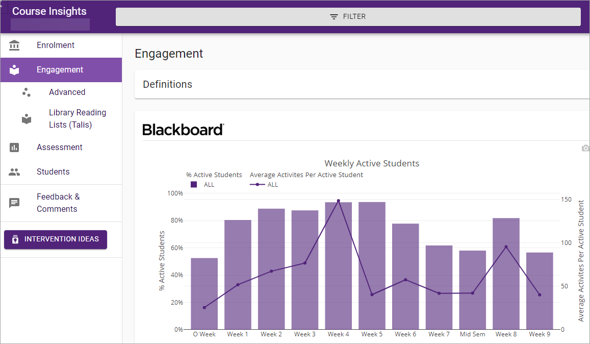
Blackboard
This section focuses on how students are engaging with the Blackboard Learning Management System.
Weekly Active Students
The Weekly Active Students graph displays the percentage of active students and the average activities per active student calculated across all criteria (i.e. overall, mobile/tablet/desktop, on-/off-campus) on the weekly basis.
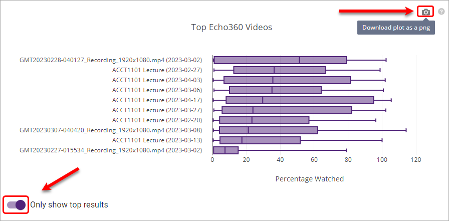
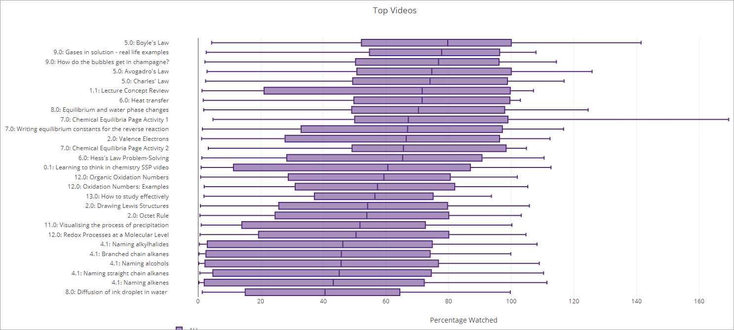
Echo360 Videos
The top 10 most watched Echo360 videos will be listed and each displayed as a box plot.
To view all videos, uncheck the Only show top result button.
To download the plot as PNG, click on the camera icon.
Tip: To better interpret the boxplots, hover your mouse over a particular video to view more information including the minimum, quartile 1, median, quartile 3 and maximum.
edX Edge
This section focuses on how students are engaging with the edX (Edge)/ UQ Extend platform.
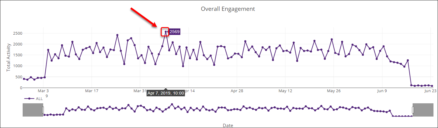
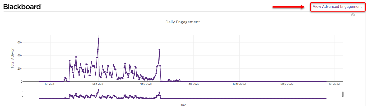
Daily Engagement
The Daily Engagement graph displays the average activity pattern per student calculated across all criteria (i.e. overall, mobile/tablet/desktop, on-/off-campus) on any given day.
- To change the date range, click and drag the bars until your desired date range is displayed.
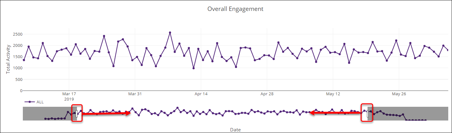
- To view a more detailed breakdown, hover your mouse over the date you wish to view more detail for.
Videos
The top 10 most watched edX Edge videos will be listed and each displayed as a box plot.
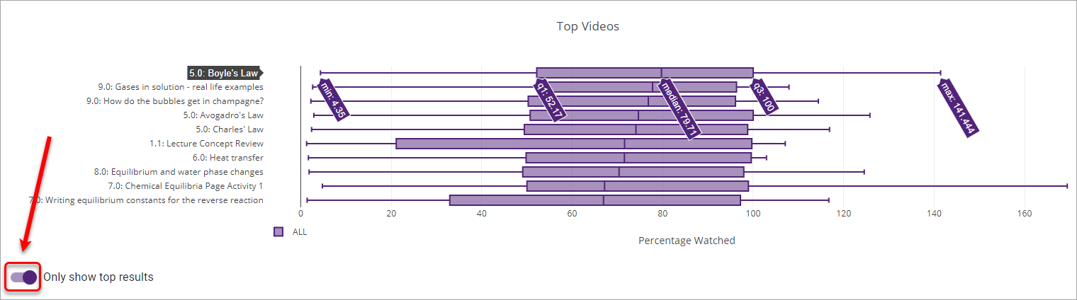
Tip: To view the full list of videos (i.e. not just the top 10), turn the Only show top results toggle OFF.
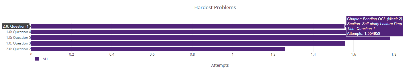
Hardest Problems
The Hardest Problems will be displayed and sorted by the problems with the highest numbers of attempts. You can hover on top of a particular problem for more information.
Additional options
Advanced Engagement
- Click on the View Advanced Engagement link.
- You will then be presented with the Video Comparison Table which includes individual boxplots for each video, a scatterplot showing Video Duration vs Average Percentage Watched and for the edX (Edge)/UQ Extend platform only, a Problem Comparison Table showing a full list of all problem attempts.
Changing from totals to averages
Turn the Show Averages toggle ON to display averages instead of totals.
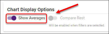
- The y-axis on the engagement graphs will change from total activity per student to average activity per student.